Makro Office: a trusted B2B partner
Summary
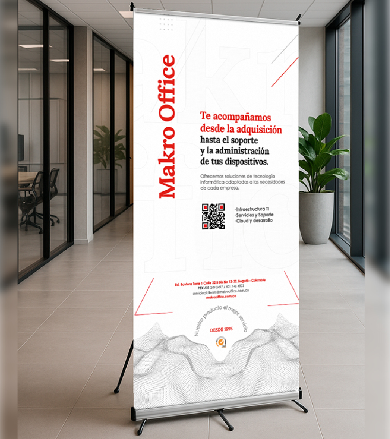
Makro Office is a company that started selling standard office supplies in 1995, and gradually evolved to offer a wide range of services nested into three pillars: I.T infrastructure, support, and Cloud development for companies operating on the fields of finance, food, advertising, pharmaceutical and education.
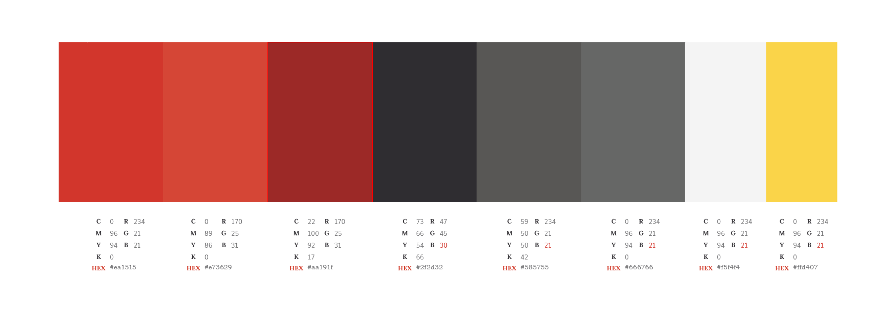
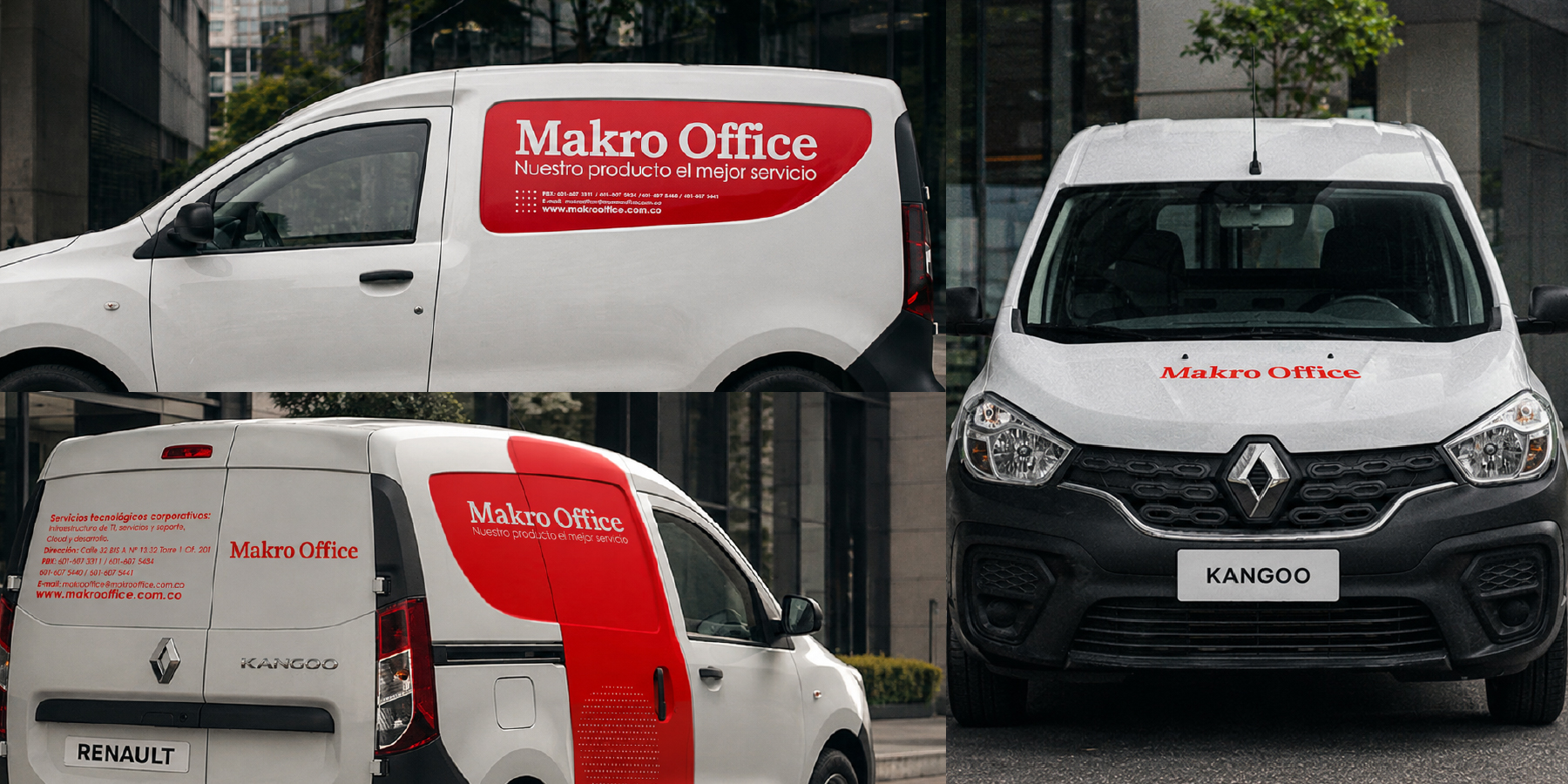
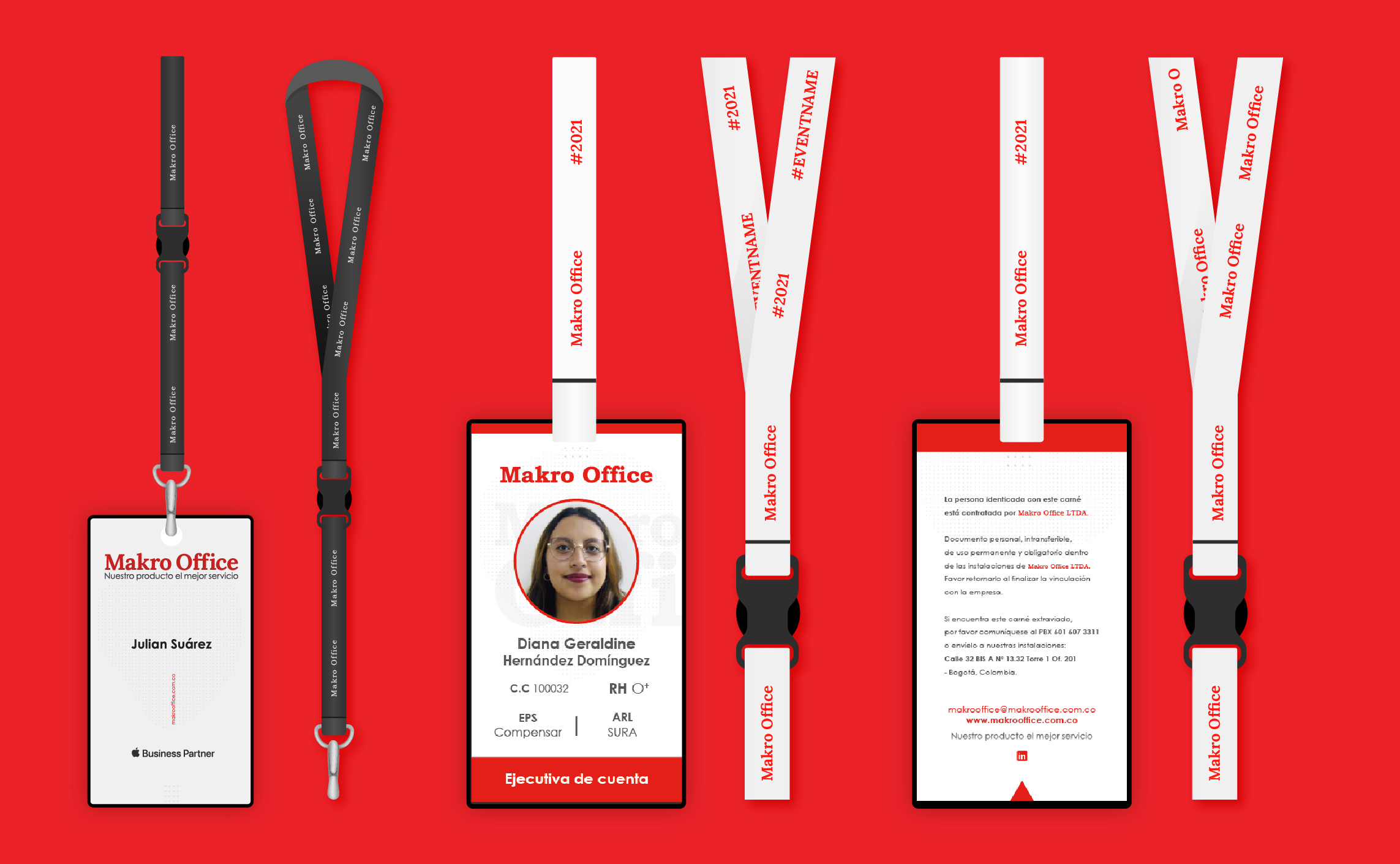
The red color resembles the company's passion to provide an outstanding service. It also resembles a balance between tradition and modernity to differentiate itself in the market, where most tech-related brands tend to be more inclined towards a cold palette.
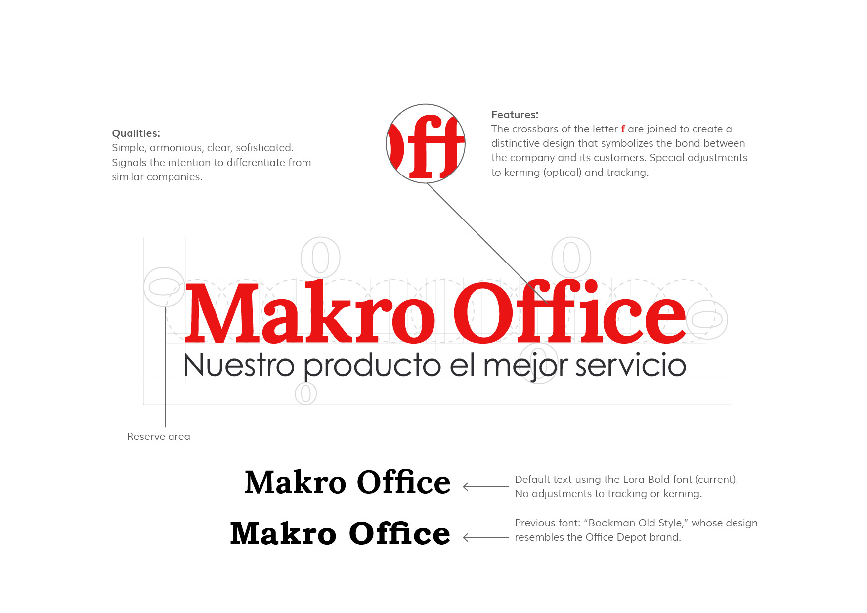
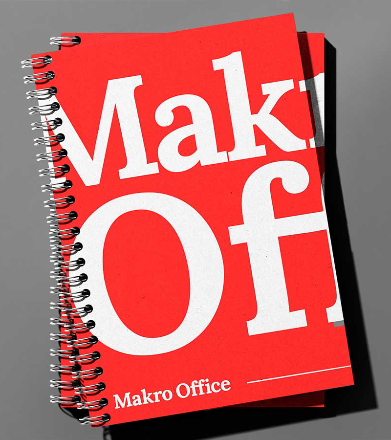
Instead of "reinventing the wheel" we decided to focus on enhancing the existing logotype in serif font, since it already conveyed the company's values and identity, and also to match the current business objectives.