A step towards digital transformation.
Summary
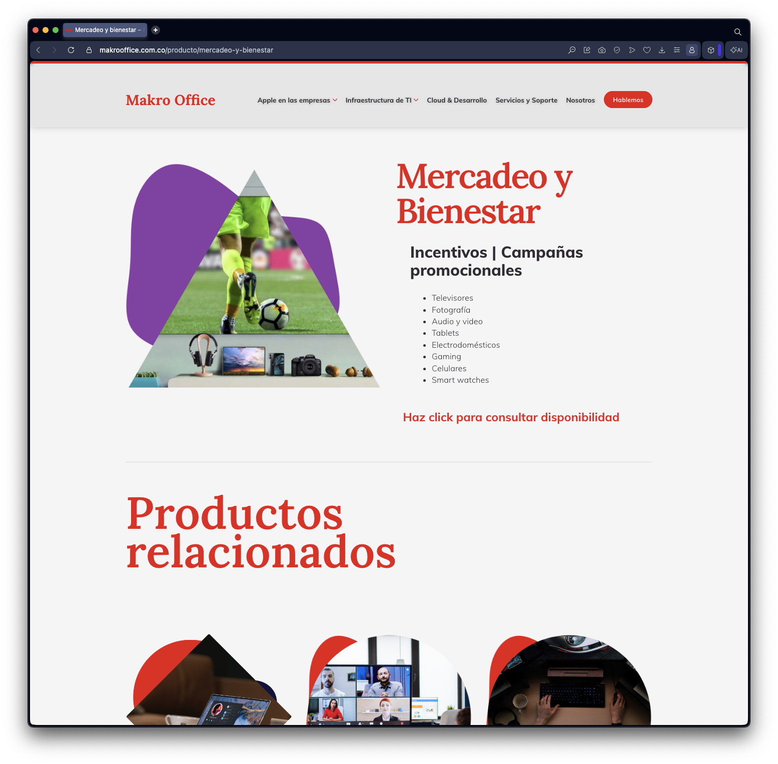
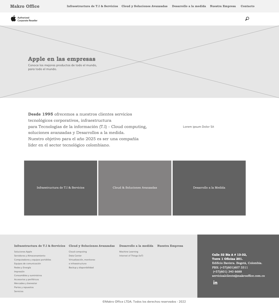
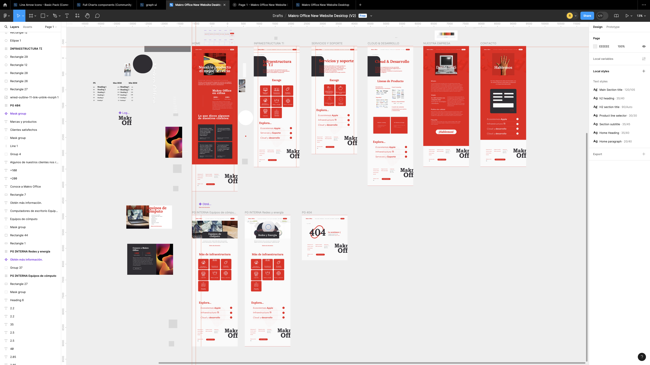
The new Makro Office website was conceived as the digital extension of its corporate services portfolio; the core commercial asset behind the company’s offer. The challenge was not simply to redesign a website, but to translate a well-established visual language into an experience that could communicate authority, expertise, and relevance in a more dynamic digital environment.
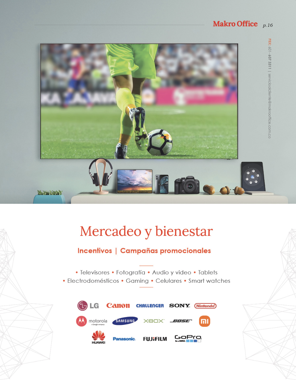
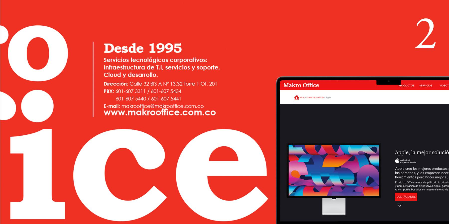
The printed portfolio became the visual foundation of the project. Its balance between tradition and modernity informed the website’s layouts, hierarchy, typography, and use of graphic elements, ensuring continuity across physical and digital touchpoints.
At the same time, the new experience introduced subtle micro-interactions and motion cues to bring the interface to life. These details created a stronger sense of responsiveness and contemporaneity, moving Makro Office away from the previous fully static website without compromising the clarity and trust expected from a corporate technology and services provider.
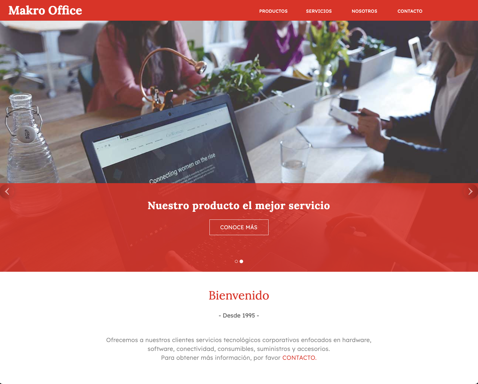
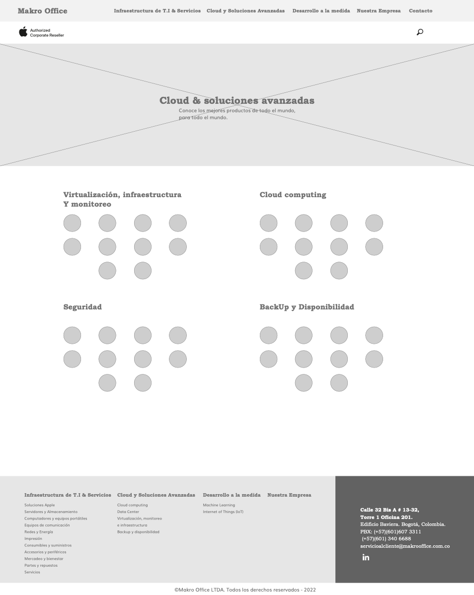
The previous website was built during the second half of 2015 and had been functioning for almost a decade. It served as the primary digital touchpoint for the company's services and offerings. However, it had notable signs of obsolescence in terms of user experience, visual presentation and performance due to it's static layout and composition, something common for bootstrap-based websites during that era.
The redesign also responded to new business objectives. Makro Office operates in a specialized B2B market, but serves organizations across a broad range of industries—including finance, food, advertising, pharmaceuticals, education, and enterprise technology. The new digital identity therefore needed to feel versatile enough to speak to multiple decision-makers, while remaining focused, credible, and commercially clear.